# Configure Layouts
Blazing Story supports Blazor's standard layout mechanism to control how stories are rendered inside the preview frame. This is especially useful when you want to wrap stories with a theme provider, apply consistent padding, or control positioning.
A layout component must inherit `LayoutComponentBase` and render `@Body` in its markup. See also: [ASP.NET Core Blazor layouts | Microsoft Learn](https://learn.microsoft.com/aspnet/core/blazor/components/layouts).
## Built-in Preset Layouts
Starting from v1.0.0-preview.81, Blazing Story ships with three ready-to-use layout components in the `BlazingStory.Components.Layouts` namespace. You can use them immediately without creating any custom layout files.
### CenteredLayout
Centers the story content both horizontally and vertically within the preview frame.
```html
```
Use this when you want to see a component in isolation, centered in the available space — ideal for buttons, badges, icons, and other compact UI elements.
### FullFrameLayout
Expands the story content to fill the entire preview frame while retaining margins.
```html
```
Use this for components that should grow to fill available space, such as panels, cards, or layout-sensitive containers.
### NoMarginLayout
Removes all margins so the story content extends edge-to-edge within the preview frame.
```html
```
Use this for full-bleed components like page shells, hero sections, or any component that must control its own spacing.
## Custom Layouts
If the built-in presets don't meet your needs, you can create your own layout component. The component must inherit `LayoutComponentBase` and render `@Body`:
```html
@inherits LayoutComponentBase
@Body
```
A story rendered with the layout above will be wrapped in `` (useful for cascading values) and will have 24 px of padding on all sides.
### Tips for Implementing Custom Layouts
#### Detecting the Frame Context
The `` element of the preview frame has a `data-bs-parent-frame` attribute that indicates the context in which the frame is displayed:
| Value | Context |
|---|---|
| `"docs"` | The frame is embedded inside a Docs page |
| `"story"` | The frame is displayed as a standalone Story page |
Use this to apply different styling depending on the context.
#### Controlling Body Margin
By default, the preview frame's `` element has a margin of `16px`. To override it, set the `--bs-preview-body-margin` CSS custom property. Because this property is undefined by default, all built-in layout components reference it with a fallback:
```css
var(--bs-preview-body-margin, 16px)
```
To remove the margin entirely in your custom layout, for example, you can set:
```css
--bs-preview-body-margin: 0px;
```
#### Reading the Zoom Level
The current zoom level of the preview frame is available via the `--bs-zoom` CSS custom property set on the `` element. Always reference it with a fallback of `1`:
```css
var(--bs-zoom, 1)
```
This is useful when you need to compensate for or adapt to the zoom factor in your layout styles.
#### Reference Implementation
For complete implementation examples, see the built-in layout components in the Blazing Story repository:
[BlazingStory/Components/Layouts](https://github.com/jsakamoto/BlazingStory/tree/main/BlazingStory/Components/Layouts)
## Specifying Layouts
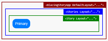
You can specify a layout at three levels. These layouts do **not** override each other — instead, they are **nested**: the application-level layout wraps the outermost layer, the stories-level layout wraps inside it, and the story-level layout wraps the innermost layer around the story content.
### Application Level
Set the outermost layout for all stories via the `DefaultLayout` property of `` in your `App.razor`:
```html title="📄 App.razor"
```
### Component (Stories) Level
Add a middle layout layer for a specific stories file via the `Layout` parameter of ``:
```html title="📄 ...stories.razor"
@attribute [Stories(...)]
...
```
### Story Level
Add the innermost layout layer for a single story via the `Layout` parameter of ``:
```html title="📄 ...stories.razor"
@attribute [Stories(...)]
...
```