Configure Arguments
Configure The Control Type
You can configure the type of control for the component parameters via the <ArgType> component inside the <Stories> component. The For lambda expression parameter of the <ArgType> component indicates which parameters to be applied the control type configuration. And the Control parameter of the <ArgType> component is used for specifying which type of control is used in the "Controls" panel to input parameter value.
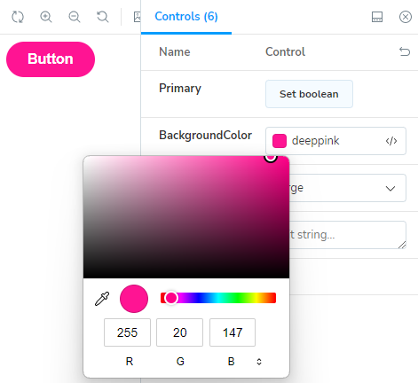
For example, if you apply the ControlType.Color control type to the BackgroundColor parameter like this,
<Stories TComponent="Button">
    <ArgType For="_ => _.BackgroundColor" Control="ControlType.Color" />
    ...
you will be able to specify the component's background color with the color picker, like in the following picture.
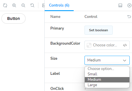
For another example, you can make the "Controls" panel use dropdown list control to choose one of the values of the enum type instead of the radio button group control, with the following code.
<Stories TComponent="Button">
    ....
    <ArgType For="_ => _.Size" Control="ControlType.Select" />
    ...
Then, you will get the result in the following picture.
Configure The Initial Value Of The Component Parameter
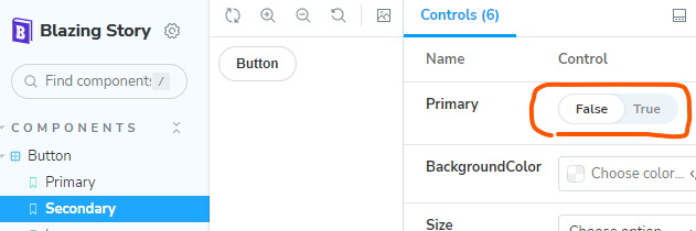
You can specify the initial value of the component parameter by using the <Arg> component inside the <Arguments> render fragment parameter of the <Story> component like this:
    ...
    <Story Name="Secondary">
        <Arguments>
            <Arg For="_ => _.Primary" Value="false" />
        </Arguments>
        ...
Configure Component Parameters Which Type Is RenderFragment
Blazing Story supports the RenderFragment type parameter in its control panel. For example, if you have a story for a component such as having a RenderFragment ChildContent parameter, you can dynamically set text to that ChildContent parameter from the "Controls" panel UI at runtime.
(NOTICE: Currently, Blazing Story allows you to set only text to the RenderFragment type parameter in the "Controls" panel UI. You cannot set fragments consisting of other components or HTML tags to the RenderFragment type parameter. This is a limitation of Blazing Story.)
However, if you mark up the ChildContent parameter inside of the component's markup, you will not be able to set text to that parameter from the "Controls" panel UI. Because the ChildContent parameter is already set with the component's markup.
    ...
    <Story Name="Default">

        <Template>
            <MyButton @attributes="context.Args">
                <!-- ❌ DON'T DO THIS! -->
                Click me
            </MyButton>
        </Template>
        ...
Instead, you should set the ChildContent parameter through the <Arguments> render fragment parameter of the <Story> component, like below.
    <!-- 👍 DO THIS! -->
    ...
    <Story Name="Default">

        <Arguments>
            <Arg For="_ => _.ChildContent" Value="_childContent" />
        </Arguments>

        <Template>
            <MyButton @attributes="context.Args">
            </MyButton>
        </Template>
        ...
@code
{
    RenderFragment _childContent = @<text>Click me</text>;
}
Provide Your Own Custom Parameter Controller
Starting from v1.0.0-preview.87, when none of the built-in controls is a good fit for a particular parameter, you can supply your own component to act as that parameter's controller UI in the "Controls" panel. For example, you may have an enum type decorated with the [Flags] attribute that you want to edit with a set of checkboxes, or a parameter that needs a domain-specific editing experience that no ControlType value provides.
To use a custom controller, supply your component as the child content of the <ArgType> component, instead of specifying its Control parameter:
<Stories TComponent="Demo1Comp">
    <ArgType For="_ => _.TestEnum">
        <Demo1Controller />
    </ArgType>
    ...
Implementing The Custom Controller Component
To make a component work as a parameter controller, derive it from the ParameterControllerBase class (which lives in the BlazingStory.Addons.BuiltIns assembly):
@using BlazingStory.Addons.BuiltIns.Panel.Controls.ParameterControllers.Controllers;
@inherits ParameterControllerBase
Deriving from ParameterControllerBase gives your component two things:
- The
this.Contextproperty (aParameterControllerContext), through which you read the current parameter value and access its metadata. - The
this.OnInputAsync(object? value)method, which you call to write a new value back to the parameter when the user edits it through your UI.
The ParameterControllerContext exposes the following members:
| Member | Description |
|---|---|
Value (object?) | The current value of the parameter. Cast it to the parameter's actual type to read it. |
Parameter (IComponentParameter) | The metadata of the parameter this controller is bound to. |
Key (string) | A unique key that identifies this controller instance (useful for element id and name attributes). |
OnInput (EventCallback) | The callback invoked when the value changes. You normally don't use this directly — call OnInputAsync(...) instead. |
Example
The following controller renders one checkbox per flag of a [Flags] enum. It reads the current value from this.Context.Value, and writes the updated value back via this.OnInputAsync(...):
@using BlazingStory.Addons.BuiltIns.Panel.Controls.ParameterControllers.Controllers;
@inherits ParameterControllerBase

@foreach (var name in this._EnumNames)
{
    var isChecked = GetValue().HasFlag(Enum.Parse<Demo1Enum1>(name));
    <div>
        <label>
            <input type="checkbox" value="@name" checked="@isChecked"
                   @onchange="@(arg => this.OnChange(name, arg))">
            <span>@name</span>
        </label>
    </div>
}

@code
{
    // The list of selectable flag values (excluding "None").
    private string[] _EnumNames = Array.Empty<string>();

    protected override void OnInitialized()
    {
        this._EnumNames = Enum.GetNames(typeof(Demo1Enum1)).Skip(1).ToArray();
    }

    // Read the current parameter value through this.Context.
    private Demo1Enum1 GetValue()
        => this.Context.Value == null ? Demo1Enum1.None : (Demo1Enum1)this.Context.Value;

    private async Task OnChange(string name, ChangeEventArgs arg)
    {
        var value = GetValue();
        var flag = Enum.Parse<Demo1Enum1>(name);
        if (bool.TryParse(arg.Value?.ToString(), out var isChecked))
        {
            // Set or clear the flag based on the checkbox state.
            value = isChecked ? (value | flag) : (value & ~flag);

            // Write the updated value back to the parameter.
            await this.OnInputAsync(value);
        }
    }
}
With this in place, the "Controls" panel uses your component to edit the parameter, while everything else — the story rendering, the initial value, and so on — keeps working as before.
Reference Implementation
For a complete, working example, see the user-defined controller story in the Blazing Story repository:
BlazingStory/Tests/Fixtures/UserControllerStory1